library(tidyverse)
library(lubridate)
library(patchwork)
library(ggthemes)12-factors
Warm Up
gss_cat gets loaded with the forcats package in the tidyverse. Use gss_cat to answer the following questions (I’d use a graph, but do whatever you’d like!)
gss_cat # A tibble: 21,483 × 9
year marital age race rincome partyid relig denom tvhours
<int> <fct> <int> <fct> <fct> <fct> <fct> <fct> <int>
1 2000 Never married 26 White $8000 to 9999 Ind,near … Prot… Sout… 12
2 2000 Divorced 48 White $8000 to 9999 Not str r… Prot… Bapt… NA
3 2000 Widowed 67 White Not applicable Independe… Prot… No d… 2
4 2000 Never married 39 White Not applicable Ind,near … Orth… Not … 4
5 2000 Divorced 25 White Not applicable Not str d… None Not … 1
6 2000 Married 25 White $20000 - 24999 Strong de… Prot… Sout… NA
7 2000 Never married 36 White $25000 or more Not str r… Chri… Not … 3
8 2000 Divorced 44 White $7000 to 7999 Ind,near … Prot… Luth… NA
9 2000 Married 44 White $25000 or more Not str d… Prot… Other 0
10 2000 Married 47 White $25000 or more Strong re… Prot… Sout… 3
# ℹ 21,473 more rowsWhich religions watch the least TV?
Do married people watch more or less TV than single people?
Try it: fct_reorder
Use rincome_summary to construct a dotplot of rincome against age.
Reorder rincome by age
rincome_summary <- gss_cat %>%
  group_by(rincome) %>%
  summarize(
    age = mean(age, na.rm = TRUE),
    tvhours = mean(tvhours, na.rm = TRUE),
    n = n()
  )
Try it fct_collapse
Collapse the marital variable to have levels Married, not_married, and No answer
Include "Never married", "Divorced", and “Widowed" in not_married
Additional examples
Hotel bookings by month
# From TidyTuesday: https://github.com/rfordatascience/tidytuesday/blob/master/data/2020/2020-02-11/readme.md
hotels <- read_csv("https://raw.githubusercontent.com/rfordatascience/tidytuesday/master/data/2020/2020-02-11/hotels.csv", show_col_types = FALSE)- Run the code and examine the plot. How are the months ordered? What would be a better order?
hotels %>%
  group_by(hotel, arrival_date_month) %>%   # group by hotel type and arrival month
  summarize(mean_adr = mean(adr)) %>%       # calculate mean adr for each group
  ggplot(aes(
    x = arrival_date_month,                 # x-axis = arrival_date_month
    y = mean_adr,                           # y-axis = mean_adr calculated above
    group = hotel,                          # group lines by hotel type
    color = hotel)                          # and color by hotel type
    ) +
  geom_line() +                             # use lines to represent data
  theme_minimal() +                         # use a minimal theme
  labs(
    x = "Arrival month",                    # customize labels
    y = "Mean ADR (average daily rate)",
    title = "Comparison of resort and city hotel prices across months",
    subtitle = "Resort hotel prices soar in the summer while ciry hotel prices remain relatively constant throughout the year",
    color = "Hotel type"
    )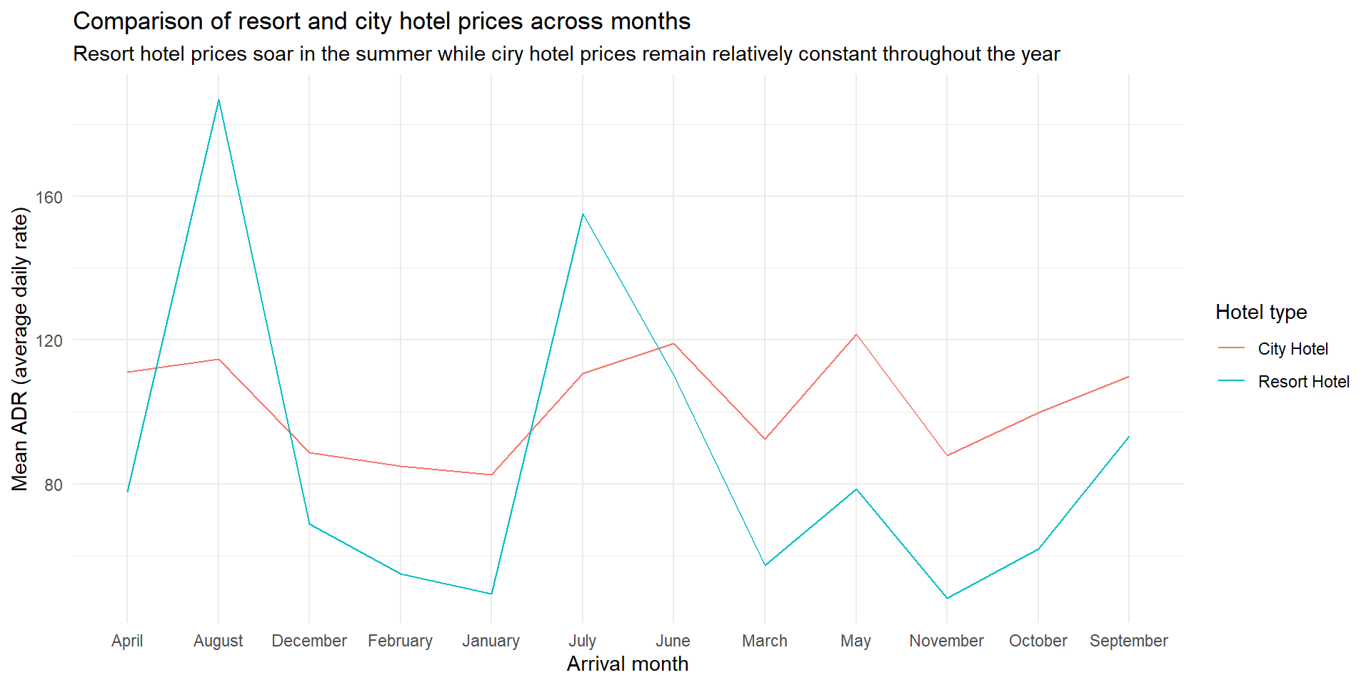
- Reorder the months on the x-axis (levels of
arrival_date_month) in a way that makes more sense. Use a function from theforcatspackage.
More hotel bookings by room type
Create a bar chart of the
reserved_room_type.Create another bar chart where you have bars for the top three room types and an “other” category lumping the other room types together.
More hotel bookings by room type
- Run the code and examine the plot. How are the months ordered? What would be a better order?
hotels %>%
  group_by(meal, arrival_date_month) %>%   # group by meal type and arrival month
  summarize(mean_adr = mean(adr)) %>%       # calculate mean adr for each group
  ggplot(aes(
    x = arrival_date_month,                 # x-axis = arrival_date_month
    y = mean_adr,                           # y-axis = mean_adr calculated above
    group = meal,                          # group lines by meal type
    color = meal)                          # and color by meal type
    ) +
  geom_line() +                             # use lines to represent data
  theme_minimal() +                         # use a minimal theme
  labs(
    x = "Arrival month",                    # customize labels
    y = "Mean ADR (average daily rate)",
    color = "Meal type"
    ) +
  ggthemes::scale_color_colorblind()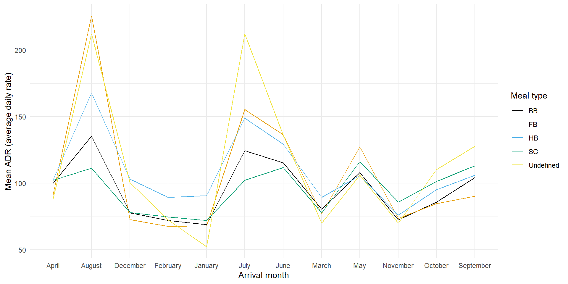
- Reorder the levels of meal type in a way that makes more sense. Use a function from the
forcatspackage to do this.